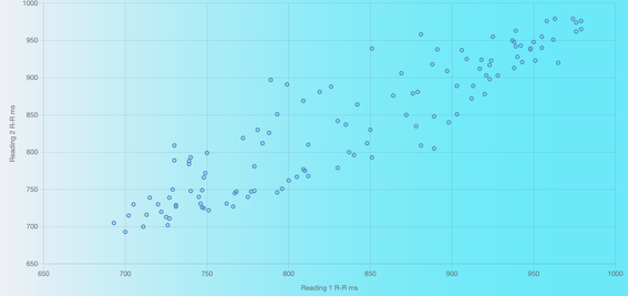
The Poincaré plot is a great way to visualise your data, and see whether you’re on a good day. It can also provide profound insights into your general health status.
The graph uses the most basic metric in the HRV arsenal, the R-R interval: the number of milliseconds between each heartbeat. Each R-R interval is plotted against the next: (R-R1,R-R2) (R-R2,R-R3) (R-R3,R-R4)…..(R-Rn-1,R-Rn).
In a healthy subject the plot results in a diagonal cigar shaped graph, from bottom left to top right. The size and proportions of the graph give you an instant picture of your condition for the day. What we do on the plot is compare today’s plot (blue), with your best (green).
For the athletes, a good plot is a signal that you’re ready to perform at your best.

A tough workout the previous day will show up as a smaller plot, and is a sign that a little recovery is due.
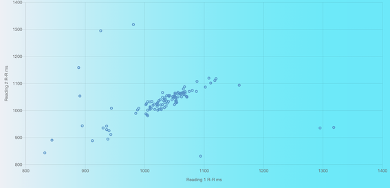
High levels of stress and/or illness show up in a plot that is concentrated and more circular than oblong. The Poincaré plot may also have outlier data points,

The outlier data points indicate that the immune system is under stress. These outlier data points are frequently seen in conjunction with extremely high rMSSD figures. The ratio metric will also provide a warning that there is cause for concern usually being below 2.
The interpretation will also give warning that there is an issue with the reading.
In cases where your reading displays these indicators, you are recommended to take an ECG reading. If this type of reading becomes a frequent occurrence, you are advised to consult a medical expert.
The recovery analysis page includes the metrics for the Poincaré plot. SD1 is the width and SD2, the length. The ratio is SD2/SD1.
Our algorithms compute the regression line of the plot. From this we are able to determine the points that fall above and below the regression line, and these appear in the columns % above and % below. We have determined that a higher percentage above the line is an indicator of good health. Conversely, a higher percentage below the line is consistent with poor health.
If you are in doubt, please contact us. We will be happy to provide guidance.
Read more:
Poincaré plot interpretation using a physiological model of HRV based on a network of oscillators
